Abstract
-------------------------------------------- EDITOR: END EDIT -------------------------------------------- -->Data has become a currency of power. This is evidenced by the fact that the most successful businesses in the world—Google, Facebook, and the like—are making their money from aggregating huge stores of the stuff and infinitely segmenting online ad audiences for marketeers. The electricity bill alone for Facebook's newest data center in New Mexico is estimated to cost $21 million per year.
Despite the grand hype around "Big Data" and the knowledge revolution it will create, there is profound inequality between those who are benefitting from the storage, collection, and analysis of data and those who are not. As the famous William Gibson quote goes, "The future is already here—it's just not evenly distributed" (The Economist 2001). And there are multiple dimensions to data inequality. The data itself is not distributed equally—ownership and access to data is largely centralized, mostly collected and stored by corporations and governments. Additionally, the technical knowledge of how to work effectively with data is in the hands of a small class of specialists who, statistically speaking, are mostly white, techie dudes. Research in the emerging field of Critical Data Studies shows how data is bound up in the interests of the collecting institution, how algorithms can be used to discriminate, and how data and surveillance are intimately intertwined.
If we are to address these power differentials, we believe strongly that we need to have more voices at the table and this is what motivates our work in data literacy. Together, we create tools, design activities, and run workshops to cultivate data literacy for artists, humanists, journalists, nonprofit and community-based organizations, policymakers, and librarians. People from these domains have been trained in close reading, public service, deep context, great storytelling, and speculative future-building. This training and these critical skills are essential to have at the table in the emerging public discourse around data and its inequalities. They can help us answer questions such as: "Whose interests motivated this collection?" "What (and who) is missing from the data set?" and "Which analytic methods might prevent us from reinscribing structural inequalities?"
Data Mindset
These questions are the beginning of what we have started to call a "data mindset," the ability to think both creatively and critically about what insights and stories might be possible to glean from data. Data scientists and entrepreneurs with purely technical training have the creative part down. For example, they might map Google searches for flu symptoms like "runny nose" and "fever" to predict where people are contracting the flu. Brilliant! Until searches for flu symptoms are no longer correlated with actual cases of the flu, that is. Why might they not correlate? For example, when there is a big media hype one year about swine flu. This is critical context for Google search data that media scholars would have understood immediately.
A data mindset means that one recognizes when there is an opportunity to find and use data to answer a particular question about the world. That data might be quantitative, in the form of census reports or instrument readings, and/or it might be qualitative, comprised of texts, survey responses, or emails amongst a community of people. A data mindset additionally means that one understands which institutions might collect the data one needs and is doggedly persistent in obtaining that data. For example, the Sun Sentinel newspaper wanted to prove that cops were speeding on the highway in southern Florida. They obtained car speed data by doing a FOIA request for individual cars that passed SunPass toll checkpoints and a separate FOIA request to the state for police car license plates. Then, by combining those data sets on the license plate number and using basic math, they were able to systematically prove that cops were speeding and endangering people's lives.
To start to employ a data mindset, you need some baseline knowledge of the stages of a data storytelling process, the range of data types, and the analytic and visual techniques you can employ at different stages. This is why we created Databasic.io.
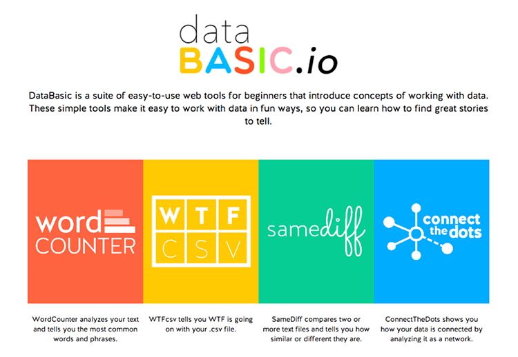
Databasic.io
In our workshops over the past 10 years with nontechnical people—storytellers and artists, public servants and scholars—we have noted a lack of tools to help introduce a data mindset to these groups. This is not for lack of tools, generally. In other work, we have catalogued more than 500 different software packages and online platforms designed to help people work with data. Many of these prioritize flashy visualizations at the expense of cultivating critical thinking and introducing data as a situated process.
For this reason, we started the project Databasic.io, a platform that introduces learners to various types of data analysis through easy tools and fun, hands-on activities. Both the tools and the activities are free, online, and open source which makes them easy to use in K–12 schools, government, newsrooms, libraries, internationally, and in other contexts where purchasing or downloading software is difficult.
Using Databasic.io, we have run workshops around the world for municipal governments, digital humanists, nonprofit consortia, artists, and community organizations, among others. We are now starting to develop a self-service online learning program called the Data Culture Project that uses video guides to take learners through the tools and activities on their own time.
In designing Databasic.io, we drew from the rich histories of traditional literacy education and designing computational tools for learning. For example, Paulo Freire's approach to contextualizing literacy in the issues, settings, and topics that matter to the learner is highly relevant. Freire conceives of literacy not just as a set of technical skills to acquire, but as a tool for empowerment towards the transformation of the status quo (Freire 2018). Likewise, Seymour Papert, the pioneer in computational education for children, asserts that learning tools should be resonant with learners and that constraints be carefully selected to provide a rich-enough, but not too-rich, environment (Papert 1980). As learners acquire more facility, they can explore more complex aspects of the topic or tool. Drawing from these traditions, we designed Databasic.io with four principles in mind:
- A focused tool strives to do one thing well. It is not an open-ended sandbox like Photoshop or Tableau, but rather has a highly constrained set of options.
- A guided tool is introduced with strong activities to get the learner started. Instead of requiring that the learner imagine usage scenarios, a guided tool presents those scenarios immediately in a way that connects to the learner's reality.
- An inviting tool is introduced in a way that is appealing to the learner. This might be through aesthetics, choice of activities, or language of invitation.
- An expandable tool is appropriate for the learner's abilities, but also offers paths to deeper learning.
We discussed these design principles at length in our journal article for the Journal of Community Informatics (2016), as well as how we used them to inform the design of Databasic.io. In the remainder of this article, we offer a short tour of the Databasic.io learning goals and tools.
Word Counter and SameDiff: Considering Text as Data
WordCounter and SameDiff are two tools in the Databasic.io suite whose primary learning goal is to introduce learners to the idea that text can be considered as data. For many of the people we work with, this idea is new. They approach data with the idea that it consists primarily of numbers. However, there are emerging use cases for analyzing text quantitatively. For example, in the field of journalism there are an increasing number of document dumps (think Wikileaks or the Panama Papers). Journalists are called upon to make sense of these documents, but the idea of actually reading all of them is out of the question. The Panama Papers included the release of 11.5 million documents, for example. In these cases and others, quantitative text analysis methods can be important for starting to seek patterns, trends, and stories from a large body of text.
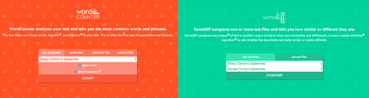
WordCounter introduces this basic idea of text as data. In the sample data drop-down, the learner can choose a corpus to analyze that includes song lyrics from Lady Gaga and Beyoncé or political speeches from Hillary Clinton and Donald Trump. Upon running the tool, it shows a word cloud, a form of data visualization that is familiar to many of our learners, where words are sized according to their frequency in the corpus. However, in the activity, we point out that while many people love word clouds (and some people hate them) they don't reveal a great deal about the context of a word. Below the word cloud, we introduce terminology like bigram—two-word phrases—and trigram—three-word phrases. Analyzing these word combinations can often reveal more about context. For example, if Beyoncé talks about "love" a lot, is she saying "I love" something, "We love" something, or "Love is" a certain way?
SameDiff takes the principles of WordCounter further and introduces the idea of comparing two corpora of text for similarities and differences. Using the same sample data from WordCounter, learners can see which words are shared between two sources, and which words are unique to certain texts. For example, Hillary Clinton used the word granddaughter on the campaign trail whereas words like hell and television were unique to Donald Trump. The learning activity for SameDiff also introduces the idea of algorithms to reveal some of the behind-the-scenes work that the tool is doing for the learner to analyze how similar and different the two texts are.
WTFcsv: Asking Good Questions of Spreadsheets
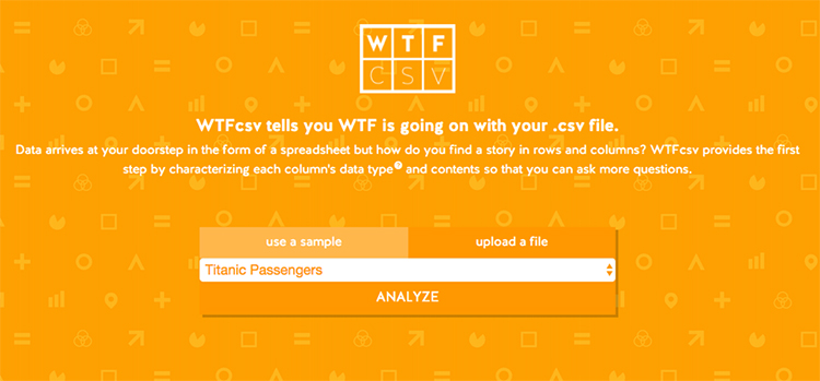
WTFcsv was named for a frequent question that learners ask upon downloading a spreadsheet of data from the internet: "What the F%$& is going on with my CSV file?" CSV stands for "comma separated values" and it's a common file format for spreadsheets like the kind you can open in Excel, Tableau, R, and other data analysis programs. Much of the data that learners work with comes in spreadsheet format, which consists of rows and columns of structured information. Upon acquiring a spreadsheet of city health inspection data or data about home exposures to environmental toxins or reports about passengers on the Titanic, learners sometimes do not understand how to take the next step to move from data to story.
WTFcsv and its accompanying activity introduce the first step in exploratory data analysis: "Asking Good Questions." The process of arriving at a story or an insight takes asking many questions of a spreadsheet. Some of the best questions are basic, such as "What does the column named ISSUDTTM mean?" or "Is the data from a reliable source?" or "Why are there so many missing values?" Other questions have to do with patterns that start to emerge in the data itself: "Why are there more pothole reports in downtown Boston versus Mattapan?" or "Why did a higher proportion of female passengers on the Titanic survive?" Asking these questions, and starting to pursue and investigate the answers, is the first step in an iterative process towards having a data-driven story to tell.
As a first step in finding patterns in the data, the tool provides basic summary statistics on the spreadsheet you upload. It introduces the concept of data types and tells you what type of information is contained in each column. When you run WTFcsv, it creates a visualization for each column in a spreadsheet to show the distribution of values. If a column has date data, it will plot those values on a time line. If it has categorical data, it will create a bar chart. If it has open text data, it will create a word cloud. In this way, learners start to compare values, see outliers, track missing data, and ask better questions. This is the beginning of a key skill: understanding how to engage in an iterative process for going from data to story.
Connect the Dots: When Your Data Is Relationships
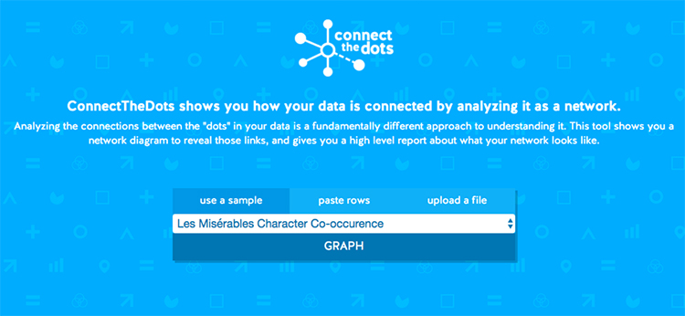
While WordCounter looks at text data and WTFcsv looks at spreadsheet data, Connect the Dots tackles a different kind of data: relationship data. Because of social networking platforms like Facebook and Twitter, many people intuitively grasp the idea of networks. What they may not have heard about is the idea of analyzing the properties of those networks to gain insights into how ideas spread, who the most connected people are, and when communities have formed. All of these are concepts that emerge from network science—a branch of data analysis that focuses on the unique properties of networks. And networks need not only be comprised of people posting cute kid pictures to their friends. Any kind of data comprised of things (called "nodes" in network analysis) and relationships between things (called "edges") can be considered network data. So, for example, pages on the web form a network of nodes (the pages) and edges (the links between the pages).
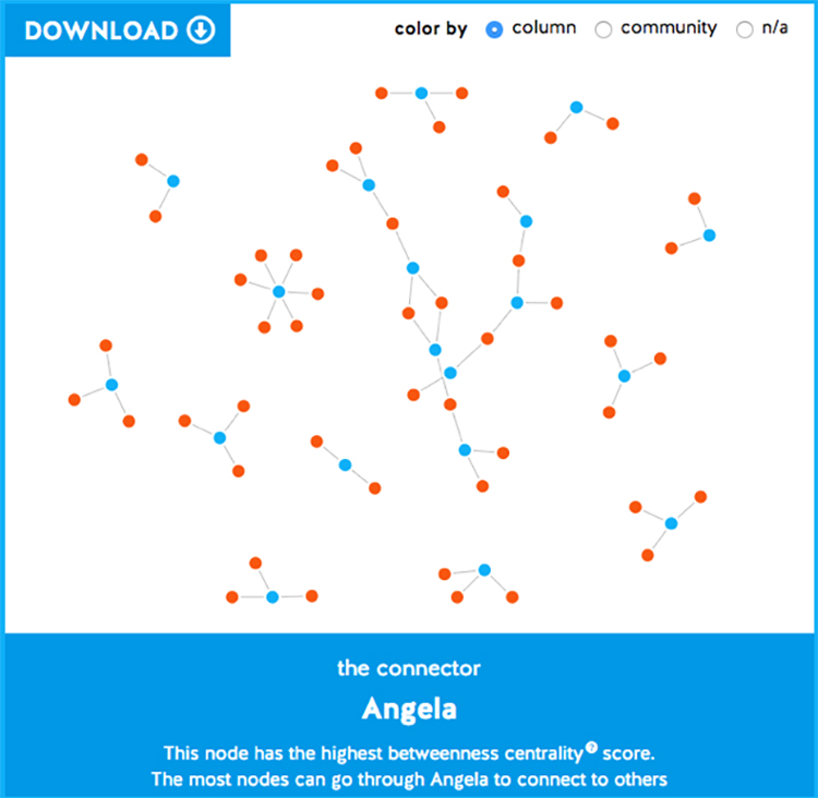
Connect the Dots introduces the idea that relationships between things can be analyzed as networks as well as the characteristics like connections and centrality that are important in network analysis. To make it concrete, the activity asks learners to talk to each other and compile a group spreadsheet of their favorite restaurants in town. Uploading the spreadsheet to Connect the Dots can help them see how the people (blue nodes) are connected to restaurants (red nodes) as well as to each other. This type of network—with two different kinds of nodes—is called a “bipartite network.” From the visualization, people can start to answer questions such as "Who in the room shares meal preferences?" "What is the most popular restaurant in this group?" As you can see in Figure 5, this type of analysis can also highlight when networks are not highly interconnected or sparse. Many of the people in the room named restaurants that others did not name.
A Data Mindset Also Means Being Transparent about Your Methods and Understanding the Limits of Your Knowledge
While Databasic.io tries to make learning about data easy and accessible, we also encourage new learners to start to appreciate when they should seek collaboration and consultation with experts. One can do a lot of meaningful data storytelling with basic techniques with off-the-shelf tools and the descriptive statistics that everyone has learned in school. However, when orienting towards making evidentiary claims from data, we remind learners to be cautious, verify their methods and assumptions, and collaborate with domain experts and methodological experts. There are many pitfalls waiting to grab new learners who want to make grand claims with data. For example, a common pitfall in geographic data is to forget to normalize for population. If you have data about cases of car crashes by state, you might be tempted to say that California is the worst and we need to focus all our resources on fixing the problem. However, that might simply be because there are more people in California. To actually compare the states fairly, we would need to get a per capita rate of car crashes.
Another example where domain expertise is essential is data like hate crimes or sexual assault that is notoriously underreported or hard to collect. In these cases, simple counts—like which college campuses have more instances of sexual assault—can actually be a signal for something else, such as whether or not they have a climate that encourages survivors to come forward (Torphy, Halnon, and Meehan 2016). Plunging blindly into the domain and considering only the data, rather than the context around the issue, the reporting incentives, and the people affected, would lead you to tell a story that is opposite to the truth. Having a data mindset means interrogating the data itself, to understand what it is saying and what (as well as who) has been left out of the spreadsheet.
Conclusion
Critical scholarship about data that is emerging from the humanities and social sciences is essential in combating data inequality. But in parallel, we need to be scaling up data literacy in professions whose work is critical, public-oriented, and equity focused. In this article, we have outlined an approach that favors the cultivation of a data mindset in nontechnical professions. Rather than seeing data literacy as a set of technical skills, statistical techniques, or particular software packages, we conceive of it as a critical and creative mindset geared towards telling stories, making arguments, and asking questions of the world. We look forward to seeing more work at the intersection of critical and creative data literacy.
Work Cited
D’Ignazio, Catherine, and Rahul Bhargava. 2016. “DataBasic: Design Principles, Tools and Activities for Data Literacy Learners.” Journal of Community Informatics 12 (3): 83–107. www.ci-journal.net/index.php/ciej/article/view/1294.
The Economist. 2001. “Broadband Blues.” June 21, 2001. http://www.economist.com/node/666610.
Freire, Paulo. 2018. Pedagogy of the Oppressed 50th Anniversary Edition. New York: Bloomsbury Academic.
Papert, Seymour. 1980. Mindstorms: Children, Computers, and Powerful Ideas. New York: Basic Books.
Torphy, Patrick, Michaela Halnon, and Jillian Meehan. 2016. “Reporting Sexual Assault: What The Clery Act Doesn’t Tell Us.” https://cleryactfallsshort.atavist.com/reporting-sexual-assault-what-the-clery-act-doesnt-tell-us.
